StakeMate
Designing a poker bankroll and partnership management platform
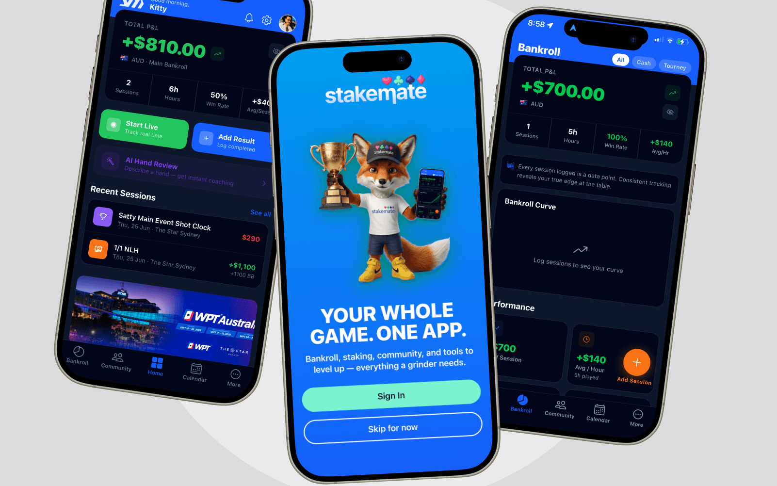
StakeMate brings bankroll tracking, staking and community into a single connected app instead of a spreadsheet, a group chat, and a handful of bookmarked tools.
Role
Product Designer / Founder
Year
2024
Platform
iOS
The Problem
Poker players typically run their game out of scattered tools — a spreadsheet for bankroll, a notes app for sessions, group chats for staking arrangements, a handful of bookmarked sites for tournaments and strategy. None of it talks to the others, and none of it reflects the community they actually play with.
My Role & Constraints
An independent product — product strategy, UX/UI and the connected data model behind it, owned solo from concept through to a working app. The real constraint wasn't any one feature; it was scope: six tool areas (bankroll, staking, community, tournaments, strategy tools, and the subscription that funds it) competing for one home screen, with no team to split the work across.
Scope: product strategy, UX/UI and information architecture, solo, end to end
Constraint: six connected feature areas sharing one home screen and one data model
Constraint: a free-to-paid boundary that had to feel like part of the product, not bolted on
Product Vision
Track → Analyse → Manage → Improve
StakeMate brings six areas — bankroll, sessions, staking, community, tournaments and strategy tools — into one app built around a single connected data model, so logging a session once updates the dashboard, a staking listing and the community feed together.
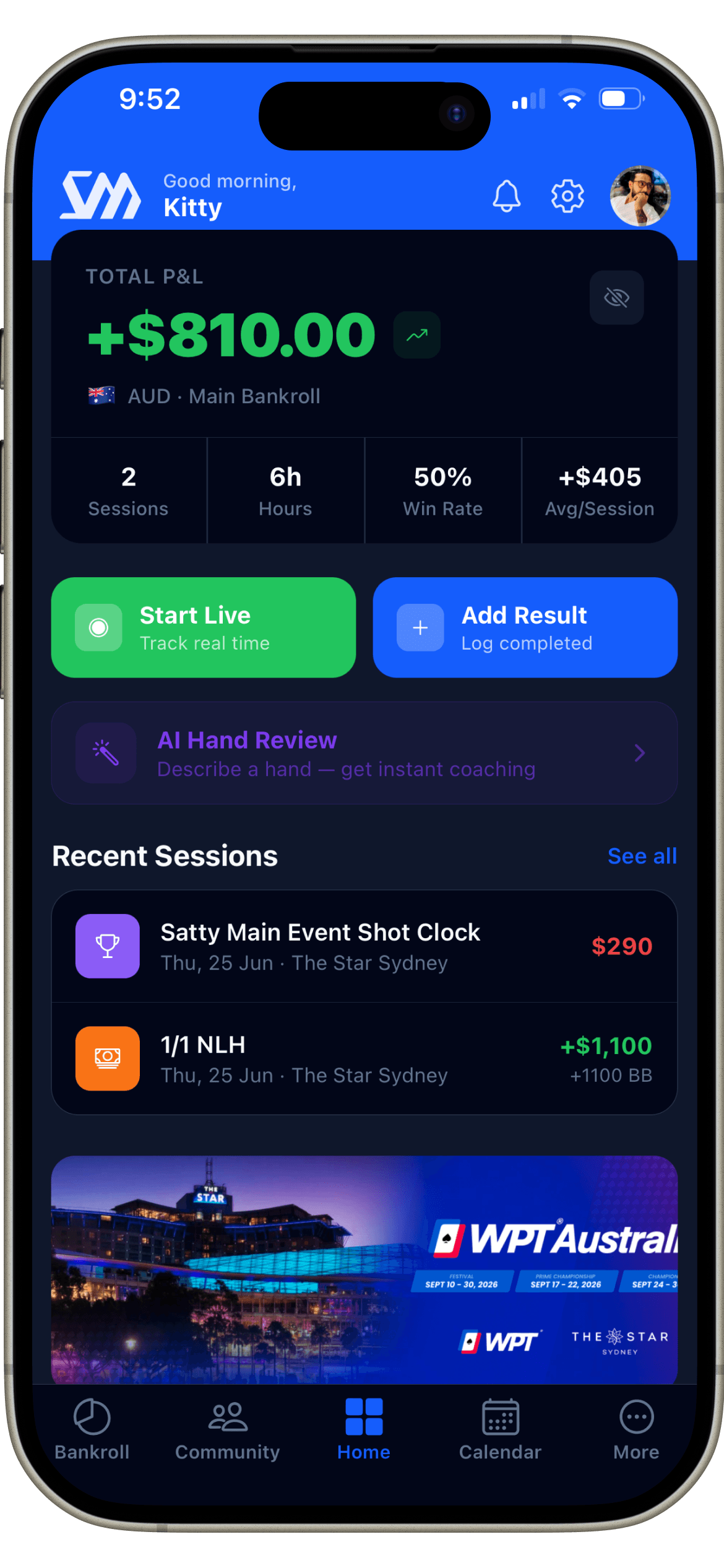
Bankroll — total P&L, sessions, win rate and per-session average, tracked live or logged after the fact
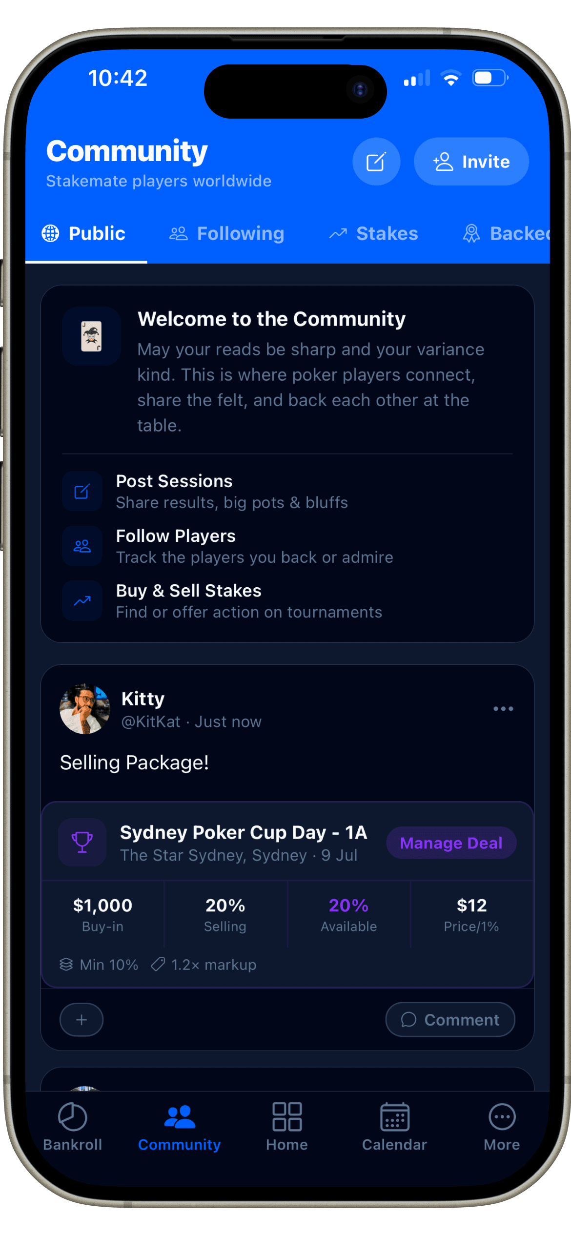
Staking — a peer-to-peer marketplace for buying and selling action, with plain buy-in / selling % / price figures
Community — a feed for posting sessions, following players and running staking deals in the open
Tournaments — a searchable directory of series and events, plus a personal schedule
Tools — GTO preflop range charts and AI-assisted hand review, built into the same app
Information Architecture
The product reads as five tabs. What's not visible from the tab bar is that staking isn't a separate section — it's a set of posts inside Community, so a staking listing is a community post, not a second, disconnected system.
Feature Deep Dive — Bankroll
Bankroll status, understandable at a glance
Bankroll is the screen a player opens most, often mid-session. The problem wasn't fitting in enough data — it was choosing which four numbers actually answer "how am I doing right now", and making the primary actions reachable without scrolling.
Separating Financial Tracking from Poker Performance
Staking lives in the community, not a back office
Staking arrangements are inherently social — they're between people who already follow each other's results. Rather than a separate staking dashboard, listings are posts inside Community: buy-in, percentage sold and price per 1% shown as plain numbers on the post itself, with a direct action to manage the deal.
Making the Dashboard Configurable
A dashboard that adapts, not a fixed layout
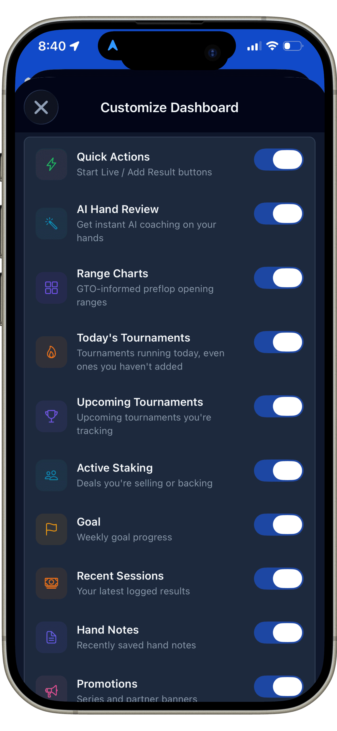
An early version showed every player the same fixed set of modules. It felt cluttered as soon as a second tool area shipped — not every player uses Range Charts or tracks a weekly goal. The fix was making each dashboard module independently toggleable, so the home screen only shows what a given player actually uses.
Product Evolution
The product grew from a single idea outward, not from a fixed spec.
Initial concept
A personal bankroll tracker — one problem, one screen.
MVP
Sessions and a dashboard, enough to replace the spreadsheet.
Current product
Six connected areas — bankroll, staking, community, tournaments and strategy tools — sharing one data model.
Future direction
Deeper AI coaching and a more open staking marketplace, building on the Elite tier already in the product.
Collaboration & Delivery
Built solo, end to end — from the onboarding flow through the range-chart module to the paywall — with no separate handoff between design and build. Every screen was designed against the same data model it would ultimately run on, so the interface and the underlying structure never drifted apart.
Outcome & What I Learned
The result is a working product — six connected tool areas and one data model, not a set of unshipped mockups. It hasn't been in market long enough to report user or revenue numbers honestly, so none are claimed here.
A configurable dashboard isn't a nice-to-have past three tool areas — it's the only way the home screen stays usable at all
What I'd Validate Next
Here's what I'd want to test if this moved further:
Usability of live session recording versus after-the-fact logging, for the same player
Comprehension of bankroll analytics — whether the four dashboard numbers answer the question players actually have
Clarity of the staking workflow for a first-time buyer of a stake
Whether staking living inside Community is discoverable, or reads as buried
Onboarding comprehension across the six-step first-run flow
Navigation efficiency between Home, Bankroll and Community for a daily-active player
A closer look
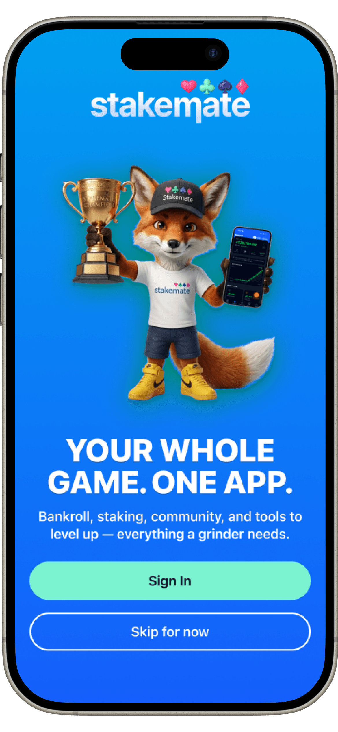 WelcomeDashboard
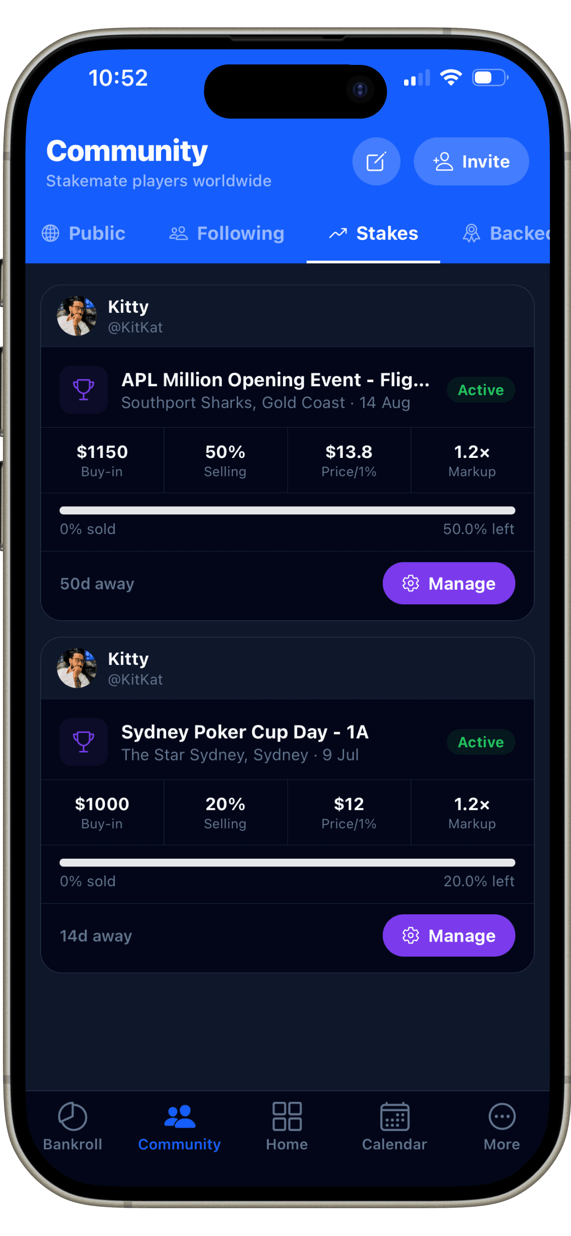 MarketplaceCommunity
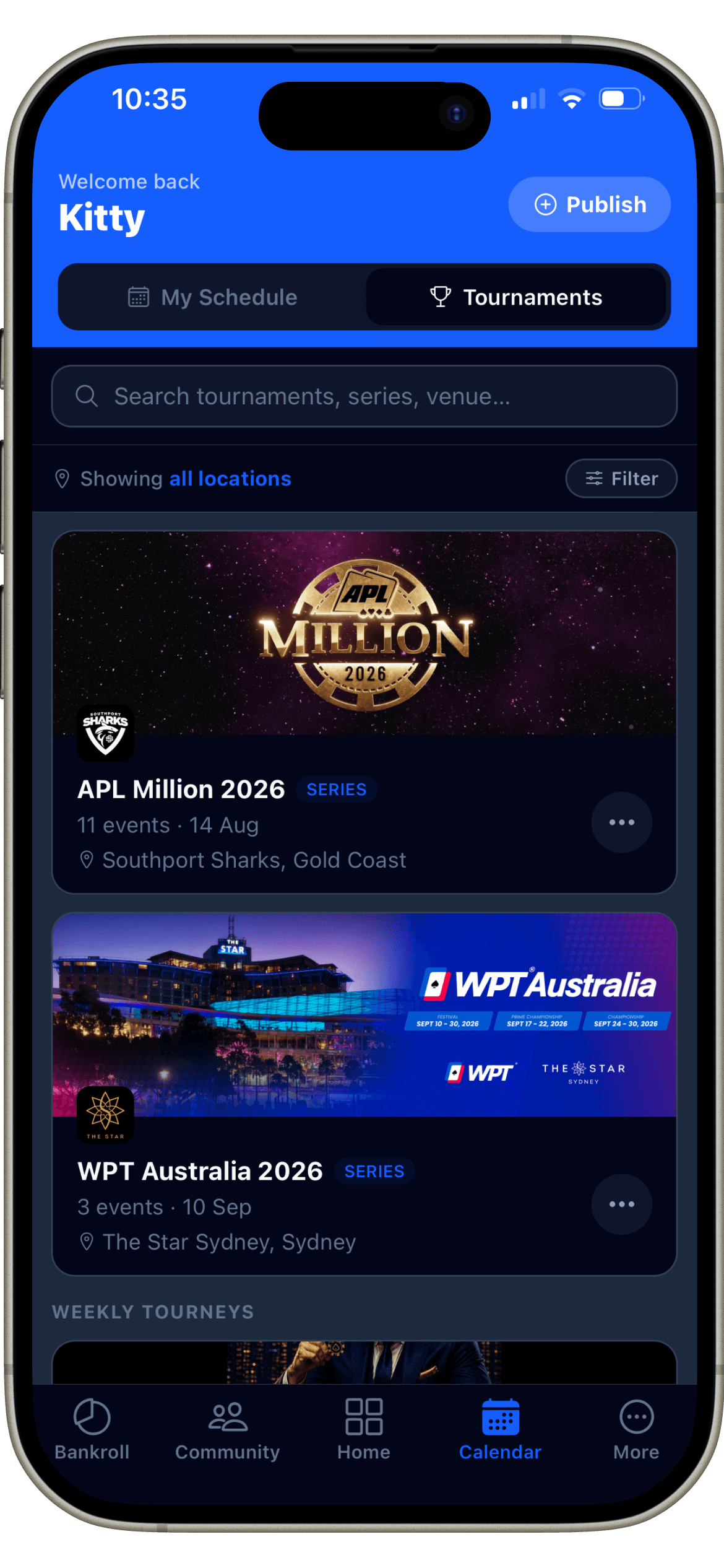 Tournaments
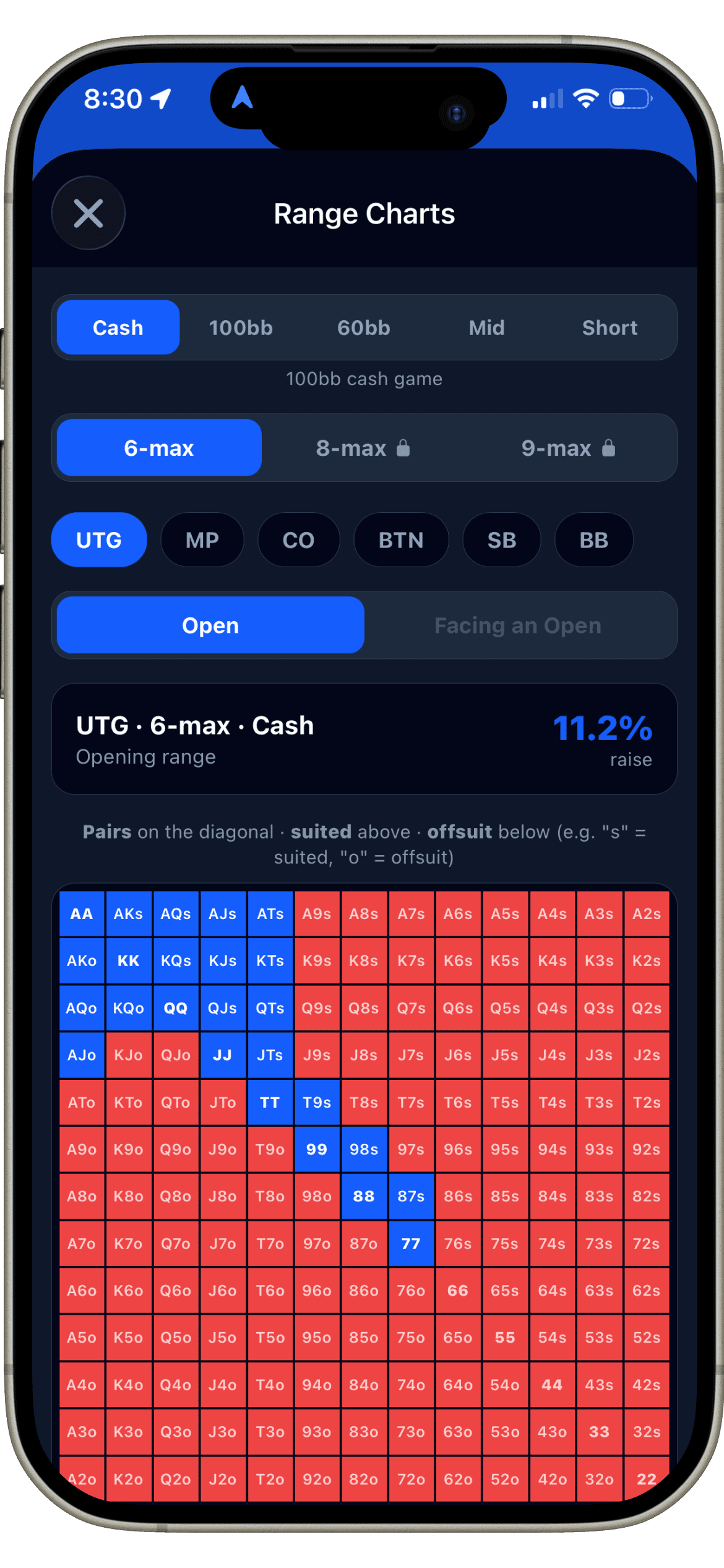 Range ChartsCustomise
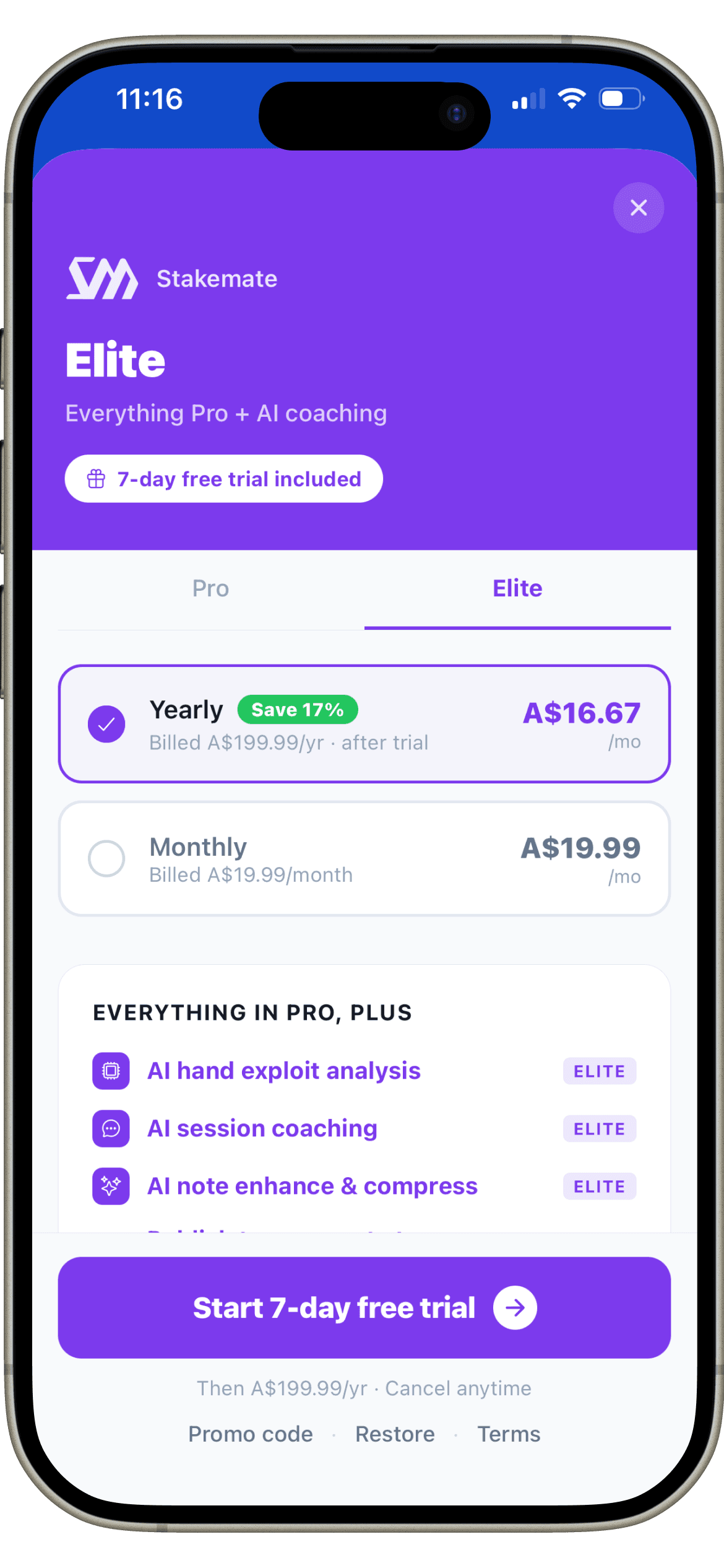 Elite Paywall
Have a similar project in mind?
Let's talk about what you're building and how I can help you ship it.